01 · The brief
The brief
Nordeus asked for an assessment of the Squad feature in Top Eleven and a full redesign of its layout, hierarchy and flows, not small tweaks. Four questions framed the assessment: how managers view and understand their squad and swap players, how they get new players onto the pitch, how they find player information, and what they do most often. Two problems were named up front.
Drag-and-drop
The mechanic for moving players is problematic. Propose a better alternative and explain how it changes interaction.
Vertical scroll
Reposition subs and reserves so the screen no longer scrolls vertically. Explain the impact on the pitch and lineup.
02 · How I worked
How I worked
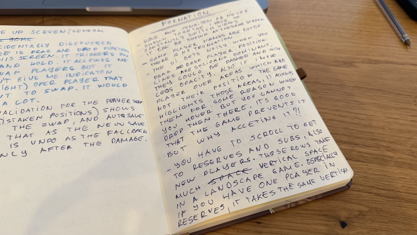
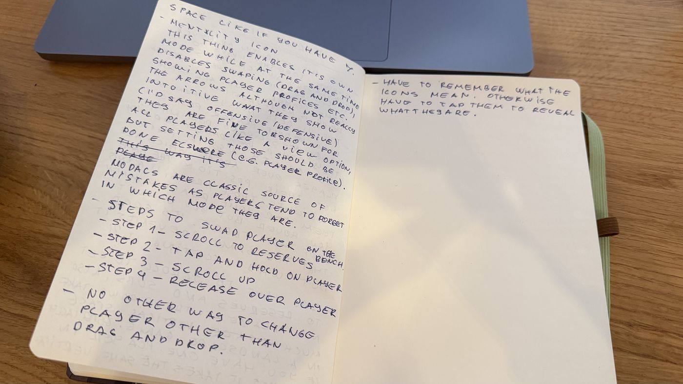
The step counts in this study come from my own play sessions, repeated until the sequence was stable; they are not a timed usability test. That test is the first thing listed under what I would test next.
03 · Squad today
Squad today
Squad is one screen with three tabs that are three different mental models: a table (Lineup), a pitch (Formation) and a settings form (Tactics). Formation is the default and carries almost every frequent task. Beneath the pitch, substitutes, reserves and newly bought players each get their own full-height row, so the screen grows downward with every transfer.
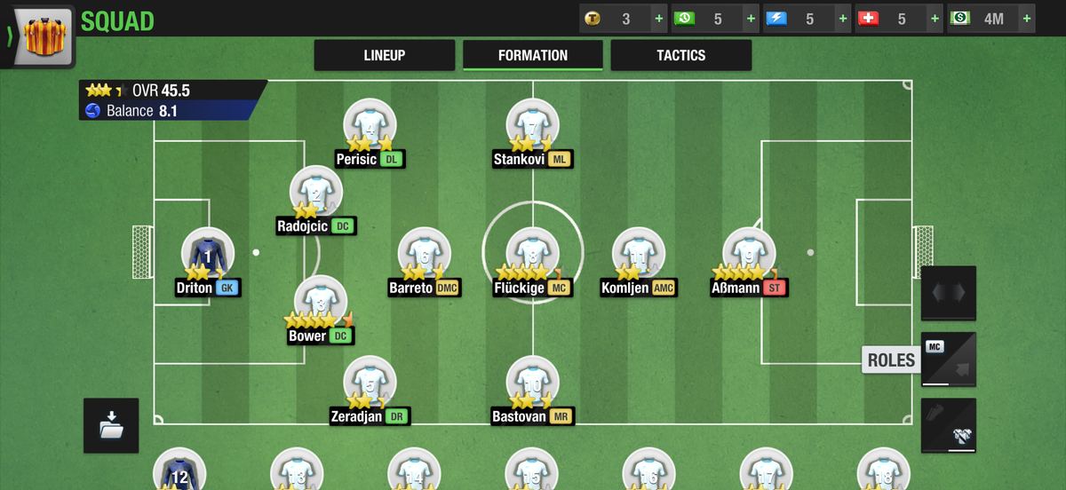
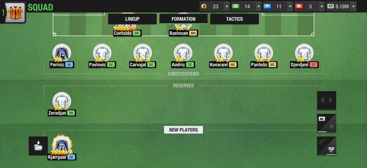
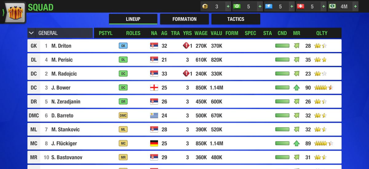
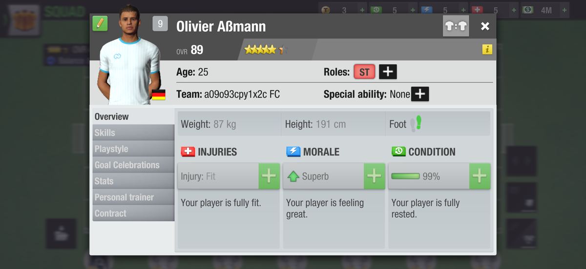
The most frequent task, step by step
Before a match a manager checks who is tired and swaps him for a sub with the same role. Today that means: switch the token mode from Roles to Condition & Morale to see who is tired, switch back to see roles, scroll down to the bench, long-press the sub (half hidden under the screen edge), scroll back up while holding him, release over a player while the finger covers the target, and only then learn from a warning icon whether the roles matched. Four steps for the swap itself; six or seven for the whole decision.
Getting a newly bought player onto the pitch is the same sequence one row lower: the new player sits in a fourth row under subs and reserves, so the scroll is longer and the tutorial that points at the right player to replace appears only once, after the first transfer. These two sequences are what the redesign is measured against.
04 · What I found
What I found
Twenty-odd individual issues came out of the breakdown. They share six root causes.
The data that decides a swap is never on screen at once
Role and condition live in two different token modes. Compare shows height and wage but not condition. The one decision the screen exists for requires switching views to make.
Everything stacks on the one axis that has no room
The game runs in landscape, yet subs, reserves and new players are stacked under the pitch in full-height rows, while both sides of the pitch are empty. Pitch and bench are never visible together.
The pitch validates after the fact
A midfielder can be dropped onto a winger's slot, a goalkeeper into defence; the warning icons and the Balance drop appear afterwards, and auto-save makes the mistake the team's new state. The rule is also inconsistent: empty grass in a foreign zone rejects the player, a player standing in that zone accepts the swap, and the Lineup list accepts it silently, while the drag highlights zones you cannot drop into. Undo exists, but only after the damage.
One gesture carries several meanings, and the rule is hidden
Dragging a pitch player either swaps or repositions depending on where he lands; dragging a bench player can only swap; dragging a row in the Lineup list also swaps, with no affordance and no highlight of the target. Tap is spent on opening the profile, so there is no way to select a player without moving him.
Depth of UI does not match depth of intent
A glance at a player's condition means either switching the whole pitch into Condition & Morale mode or opening a seven-tab profile modal that covers 90% of the screen; comparing two players opens a second modal on top of the first. The deepest data, 26 attributes per player, lives in the Lineup tab, a table with no pitch at all.
The game already knows the right candidate, and never offers him
Compare defaults to a same-role player. The new-player tutorial points at the exact player to replace. That logic exists in the product but is not used where the swap actually happens.
Smaller findings (unlabeled mode rail, touch targets below 7 mm, zone labels hidden behind tokens, truncated names, Squad Setups behind a folder icon) are listed in the appendix of the working document and addressed in the redesign where they fall under a principle.
05 · Principles
Principles
Each root cause became a rule. The current screen breaks all five, and every decision in the redesign points back to one of them.
Decision data stays in view.
Role, condition, morale and warnings are visible on every player token, in every state, without switching modes.
Validate before, not after.
While the manager is choosing, invalid targets are visibly disabled and the effect on Balance is shown before the action is confirmed.
One gesture, one meaning, everywhere.
Selecting, swapping and fine-positioning are distinct interactions, and a gesture means the same thing whether it starts on the pitch, the bench or the reserves.
Everything that can go on the pitch is visible next to the pitch, never under it.
The squad uses the width a landscape screen has, so pitch and roster are always seen together.
Depth of information follows depth of intent.
A tap gives a light, in-context peek; a full screen is for when the manager wants everything. No modal on a modal.
06 · Explorations
Explorations
Three layouts for the roster and three interaction models for moving players were sketched and scored against the principles and against the step count for the most frequent task.
Where does the roster live?
Side roster panel
Subs, reserves and new players in one scrollable panel beside the pitch, with role filter and search. Pitch ~25% narrower, always whole.
Compact strip under the pitch
One horizontally scrolling row; Subs / Reserves / New as a filter, not as rows. Pitch one token row shorter.
Contextual bench
No permanent bench; candidates appear only once a pitch player is selected. Largest pitch, but the bench is not visible at a glance.
How does a player move?
Tap-tap swap
Tap selects; valid targets light up; tap a target to swap. Two taps, nothing under the finger.
Slot-first pick
Tap a slot, pick from a list of candidates sorted by fit, with inline comparison.
Suggested substitution
The game proposes a swap for tired or injured players; one tap confirms. Drag remains as an expert shortcut.
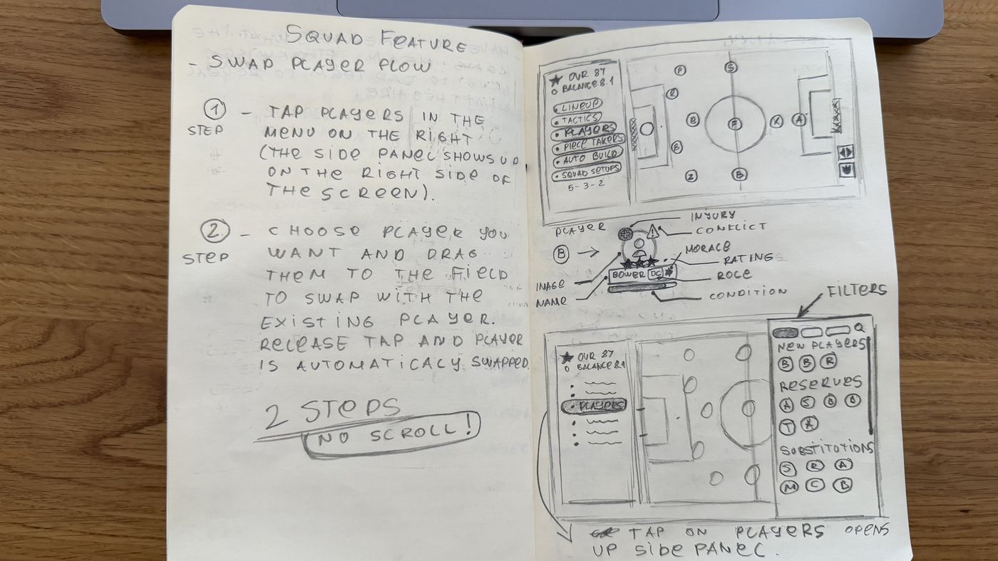
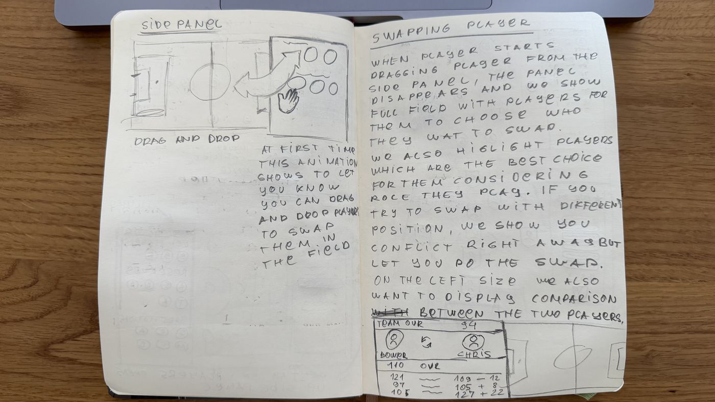
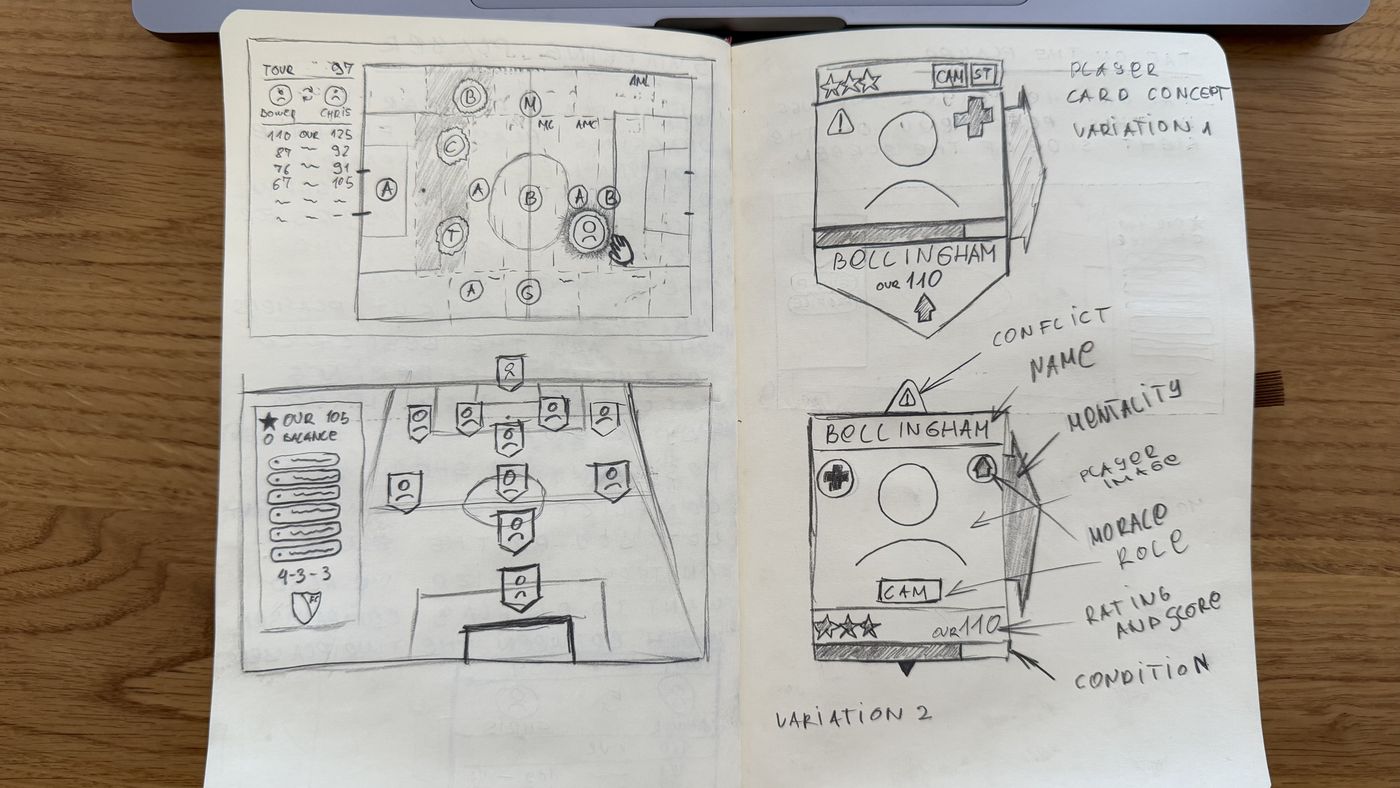
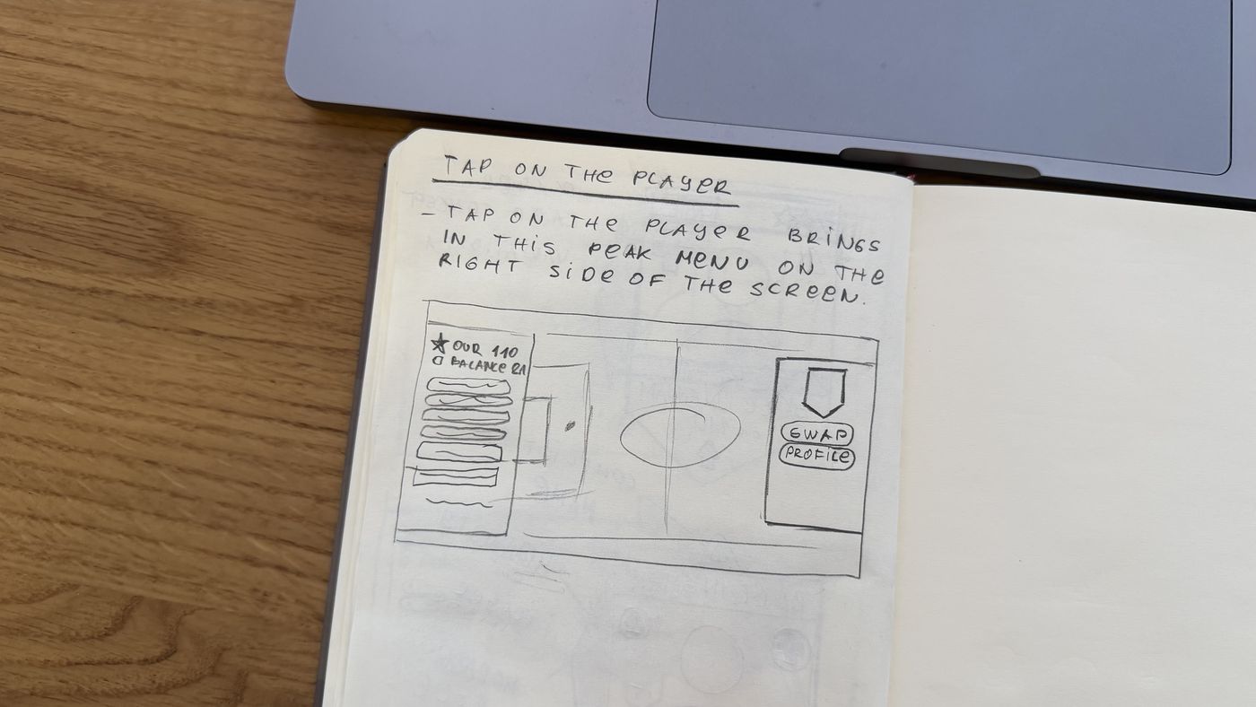
Scoring
| Option | P1 | P2 | P3 | P4 | P5 | Pitch | T1 steps |
|---|---|---|---|---|---|---|---|
| A · Side roster panel | ✓ | – | – | ✓ | ✓ | ~ 70% width | – |
| B · Strip along the pitch edge chosen | ~ ¹ | – | – | ✓ | ✓ | ✓ whole | – |
| C · Contextual bench | ✗ | – | – | ✗ ² | ✓ | ✓ whole | – |
| 1 · Tap-tap swap chosen | – | ✓ | ✓ | – | ✓ | – | 4 taps |
| 2 · Slot-first pick | – | ✓ | ✓ | – | ✗ ³ | – | 3–4 taps |
| 3 · Suggested substitution | – | ✓ | ~ ⁴ | – | ✓ | – | 1 tap |
✓ meets the principle · ~ partly · ✗ breaks it · – not relevant. Highlighted rows are the options chosen. ¹ Mini tokens show OVR and role; the full token appears when the strip expands. ² Largest pitch, but the manager cannot see who is on the bench. ³ A list for every swap, even the obvious one; kept only for empty slots. ⁴ A third way to move a player and a trust risk; kept as Auto build and as fit-sorted candidates.
The choice: substitutions live in a compact strip along the bottom edge of the pitch that expands into full tokens on demand (B), reserves and new players open as a side panel only when needed (A, on demand), and tap-tap is the primary way to move a player while drag stays as an expert shortcut with the same rules (1). B over A because the pitch is the one element every task needs and B is the only layout that keeps it whole; tap-tap over drag because it is the only model where the target is visible and validated before the manager commits.
07 · The redesign
The redesign
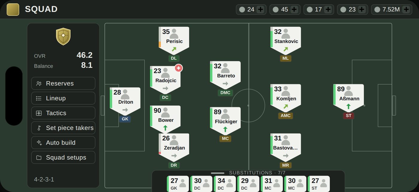
One whole pitch, the bench along its edge, and every token tells you what you need to decide.
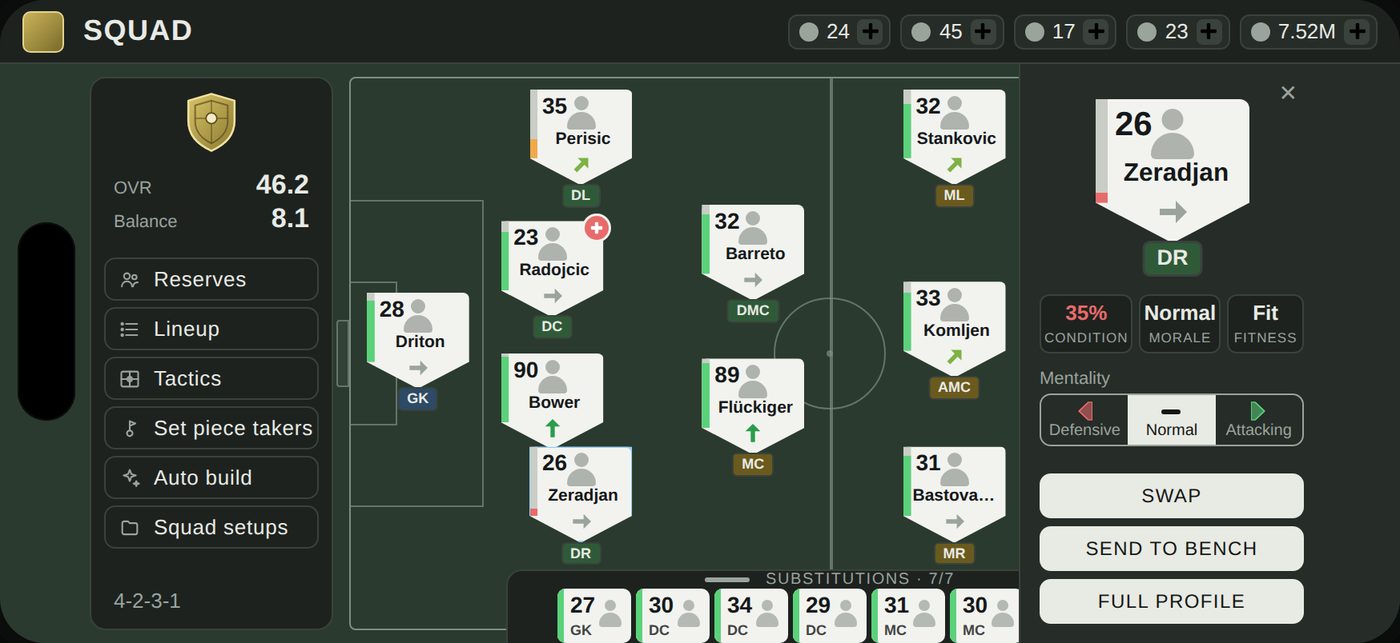
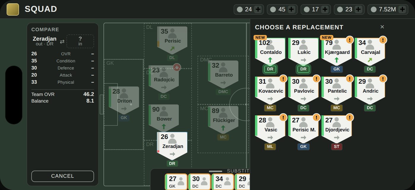
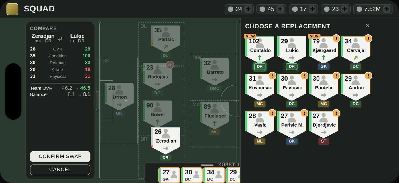
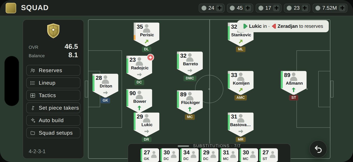
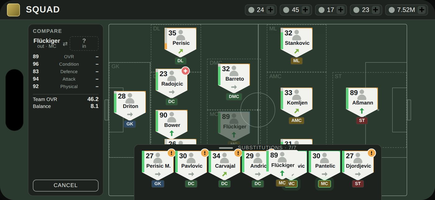
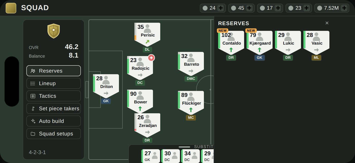
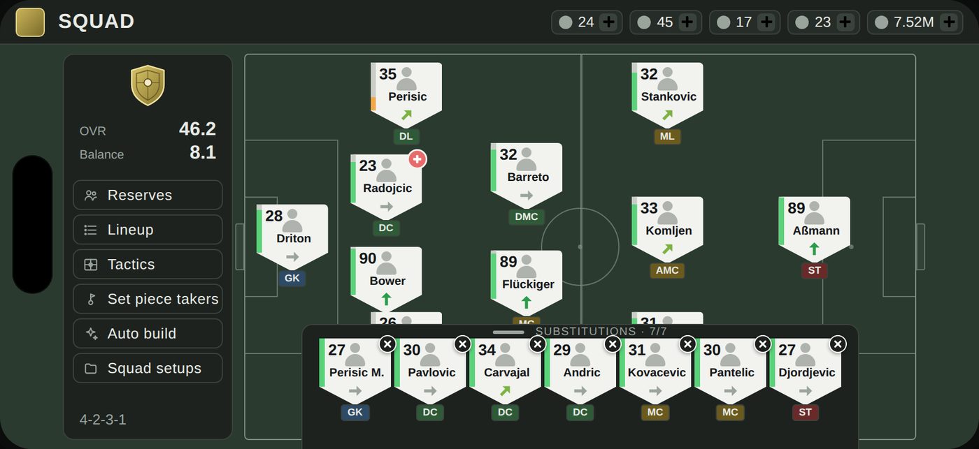
The pitch fills the screen from the header to the bottom edge; a card on the left holds the club crest, team OVR and Balance, and the squad's other tools (Reserves, Lineup, Tactics, Set piece takers, Auto build, Squad setups). Substitutions sit in a strip along the bottom edge of the pitch as seven mini tokens with OVR and role, and open into full tokens on a tap, or on their own when a dragged player comes near. Reserves, including newly bought players marked NEW, open as a panel on the right only when needed. Every token shows OVR, role, condition, morale and warnings at once, so the three token modes are gone. A tap on a player opens a small peek beside him with Swap, Send to bench and Full profile; Swap lights up every valid replacement and dims the rest, and the swap is confirmed from a comparison that shows team OVR and Balance before and after. Hold and drag still works, with the same rules as today and the same live comparison, and the profile is a full page, not a modal.
New structure
Today
- Formation tabpitch + three token modes + subs / reserves / new rows under it
- Lineup tab26-column table, hidden drag-to-swap
- Tactics tab
- Player profile7-tab modal over the pitch, purchase buttons first
- Comparea second modal on top of the profile
- Mentalitya mode that changes what every tap does
- Squad Setupsbehind an unlabeled folder icon
Redesign
- Squad screenwhole pitch, one token design, Substitutions strip (collapsed / expanded)
- Reserves panelon demand, right side; new players inside it with a NEW badge
- Menu cardleft: crest, OVR, Balance, Reserves, Lineup, Tactics, Set piece takers, Auto build, Squad setups (named, not numbered)
- Peekon tap, beside the player: condition, morale, fitness, mentality, three actions
- Player profilefull page with the game's existing tabs; Compare is a button on it that opens its own page
- Comparea step inside the swap flow, not a modal
- Token mode rail (Roles / Condition / Stars)
- Stacked rows under the pitch
- Mentality mode (now a control in the peek)
The player token
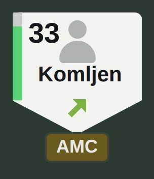
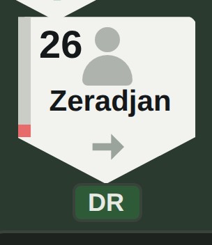
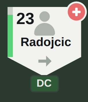
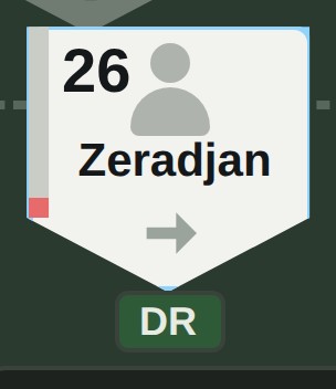
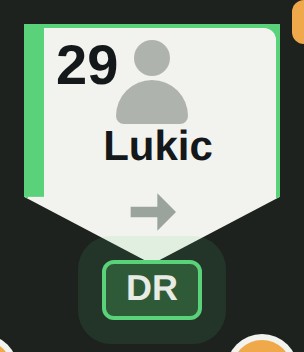
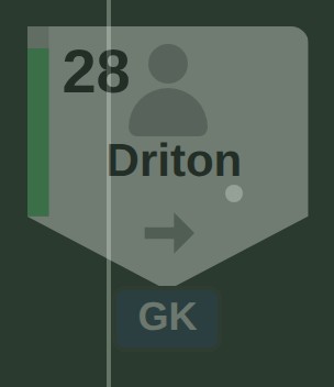
A shield-shaped token with a coloured condition bar on its left edge, OVR top left, the player's name, a morale arrow (colour and angle), and the role badge in the game's role colours under the tip, which doubles as the pointer to the slot. Warnings sit over the avatar: a red cross for injury, a yellow triangle for out of position. A mentality arrow shows flat behind the shield when it is set. Nothing on it changes with a mode, so principle P1 holds in every state.
Flow 1 · Replace a tired player
Or one drag, with the same highlights and the same comparison.
Flow 2 · Get a new player onto the pitch
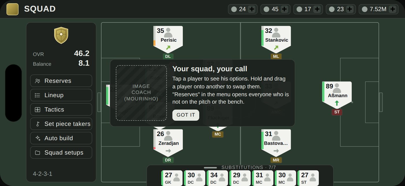
There is no separate flow, and that is the point. A newly bought player is a reserve with a NEW badge: he appears at the front of the Reserves panel and, because candidates are sorted by fit, at the front of the replacement list for any player in his role. Getting him onto the pitch is the same four taps as Flow 1, started from either end: tap him in Reserves and choose who he replaces, or tap the player to replace and pick him. The displaced player goes to the bench if a bench slot is free and to reserves otherwise, and the toast says which. The one-time Mourinho tutorial is replaced by a first-run card that explains the two gestures once, before the first transfer rather than after it.
Flow 3 · Look deeper: peek, profile, compare
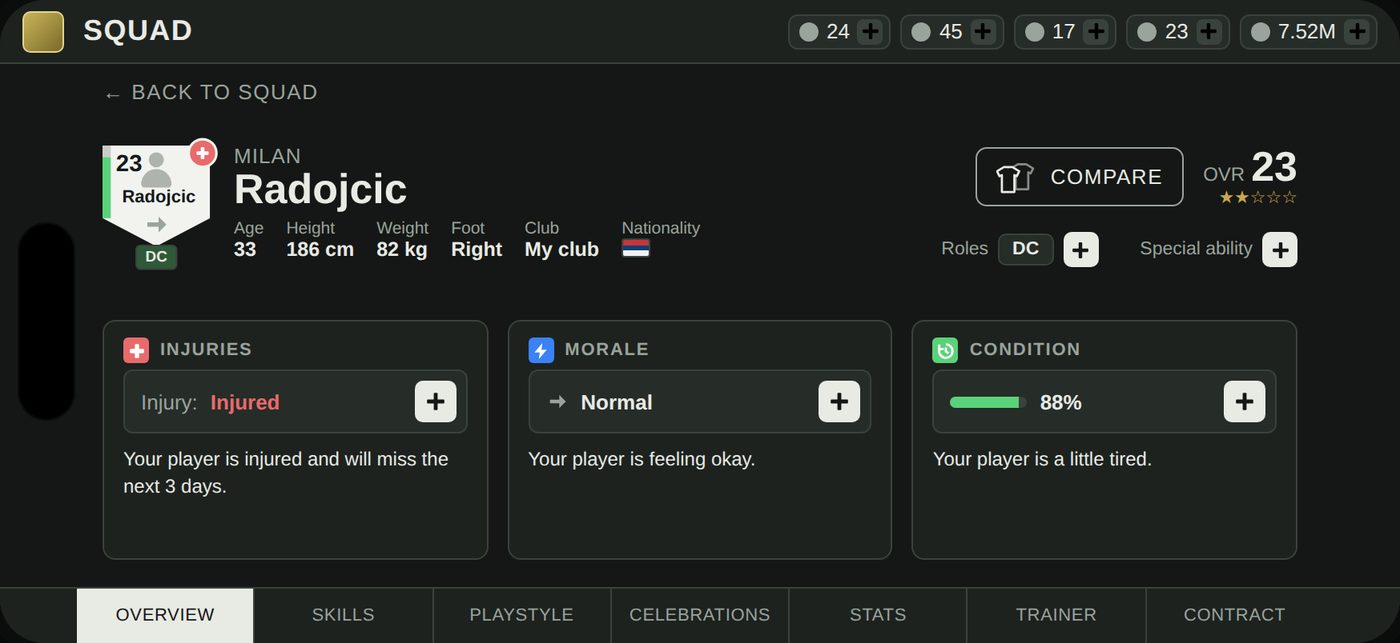
Three depths for three intents (P5). A tap gives the peek: what you need to decide a substitution, beside the player, with the pitch still visible. Full profile is a page with the game's existing tabs, where the three things the peek summarised (injury, morale, condition) are the first three cards, with the game's own wording, and buying or training a player stays where it belongs. Compare is no longer a modal on a modal: it is the step before every swap, and a button on the profile that opens its own page for when you want it without swapping (that page is out of scope for this prototype).
What was kept
Role zones and out-of-position warnings, moved from after the drop to before it. Undo after every action. The token's visual language: role colours, the glow on a new signing; star tiers moved to the profile, where they are read, not scanned. Squad Setups as a feature, given a label and names instead of numbers.
08 · The two known issues
The two known issues, answered
Drag-and-drop
Tap replaces drag as the primary way to move a player: tap a player, tap Swap, tap the replacement, confirm. The swap costs four taps instead of a long-press carried across a scroll, needs no precision because the target is a whole lit token rather than a point under the finger, and is discoverable because the first tap on any player shows the Swap action. Validation moves in front of the action: targets that would break a rule do not light up, poor fits carry their warning before the tap, and the effect on team OVR and Balance is shown before the swap exists. Drag does not disappear. It keeps the game's current rules, a pitch player dragged onto another swaps, dragged onto empty grass in his zone repositions, a bench or reserve player can only swap, and it borrows the tap flow's highlights and live comparison, so the two never disagree about what is allowed (P3). The one thing only drag does is fine repositioning inside a zone, which is a positional adjustment rather than a squad decision, and it stays with the gesture that is natural for it.
Subs and reserves without vertical scroll
Substitutions moved from rows under the pitch to a strip along its bottom edge; reserves and new players moved into a panel that opens on the right on demand. The pitch loses nothing in height and nothing in width: the strip overlaps only the bottom margin of the grass and the role zones and their labels stay legible, which was the reason for choosing it over a permanent side panel. The lineup gains a bench that is always visible, as seven mini tokens with OVR and role, and expands to full tokens on a tap or when a drag approaches it. Subs, reserves and new players stop being three rows and become one bench plus one list in which new players are a badge, so a 25-player or 40-player squad costs the same screen as a 14-player one. The screen never scrolls vertically; the only scrolling element is the Reserves list inside its panel.
09 · Prototype
Prototype
A clickable mid-fidelity prototype of the Squad screen, built with my own squad's data. It covers the substitution flow by tap and by drag, the bench strip, the Reserves panel with new players, the peek, the full profile and undo. Open it on a laptop or in landscape on a phone.
I have not yet run the prototype with other managers; the first test I would run is listed below.
10 · What I would test next
What I would test next
11 · AI usage
AI usage
As the brief allows, I used an AI assistant (Claude) as support and disclose exactly where. Research: searching the help center, forum and guides, and summarising how EA FC, Football Manager Mobile and OSM handle the same tasks. Documentation: turning my notes and screenshots into the working document, and drafting the text of this page from those notes, which I then edited. Ideation: a first draft of the five principles, which I corrected and reworded. Prototype: the clickable prototype was coded with the assistant from my sketches and my written instructions, over roughly eighty iterations in which I specified every layout, token, state and rule and reviewed each screenshot. Assets: the placeholder avatars and the screenshots on this page were generated from that prototype.
What is mine without assistance: all play sessions, observations and step counts; every pain point and the six insights; the choice of directions and the scoring; all sketches; every design decision in the redesign and the prototype. No finding on this page was taken from the assistant without being checked in the game.